

Choosing the right paint colours for your home is one of the most important decisions you’ll make during any renovation or refresh project. The colours you select will influence not only the aesthetic appeal of your space but also how you feel when you’re in it. Whether you’re planning to transform your interiors, revitalise your exterior, or restore a heritage property, understanding the fundamentals of colour selection will help you create a space you’ll love for years to come.
Understanding Colour Psychology

The psychology of colour plays a significant role in how we experience our living spaces. Different colours evoke different emotional responses, which is why selecting the right shade goes far beyond simply choosing what looks good on a paint chip.
Research from the University of Sydney demonstrates that warm colours like reds, oranges, and yellows can create feelings of energy and warmth, making them ideal for social spaces like living rooms and dining areas. These hues stimulate conversation and activity, which is why they’re often chosen for areas where families gather.
Cool colours such as blues, greens, and purples tend to have a calming effect, making them excellent choices for bedrooms and bathrooms where relaxation is the priority. Studies in environmental psychology show that blue tones can actually lower heart rate and blood pressure, promoting a sense of tranquillity.
Neutral colours like whites, greys, and beiges provide versatility and timelessness. They create a sophisticated backdrop that allows furniture and artwork to take centre stage, whilst also making spaces feel larger and more open.
When selecting colours for your home, consider not just the aesthetic appeal but how you want to feel in each room. Our colour consultancy services can help you navigate these choices and find the perfect palette for your lifestyle.
The Impact of Natural Light
Natural light is perhaps the most crucial factor in how paint colours appear in your home. A colour that looks perfect in the paint shop may look entirely different once it’s on your walls, and this is largely due to the quality and direction of natural light in your space.
North-facing rooms in Australia receive consistent, bright natural light throughout the day, which can make colours appear more vibrant and true to their sample. These rooms can handle both warm and cool tones effectively, giving you more flexibility in your colour choices.
South-facing rooms receive less direct sunlight and tend to feel cooler. In these spaces, warm colours can help counteract the lack of natural warmth, making the room feel more inviting and comfortable.
East-facing rooms are bathed in warm morning light but can feel cooler in the afternoon. Consider how you use these spaces most frequently when selecting colours. If it’s a breakfast room or home office used primarily in the morning, you might embrace the warm light with complementary tones.
West-facing rooms receive warm afternoon and evening light, which can intensify warm colours. If you choose a warm palette for these rooms, be mindful that the colours may appear quite intense during golden hour.
Always test paint samples on your walls and observe them at different times of day before making your final decision. Paint a large enough swatch (at least one square metre) to get a true sense of how the colour will look.
Room Size and Colour Considerations
The size of your room should significantly influence your colour selection. Paint colours can dramatically alter the perceived dimensions of a space, making it feel larger, smaller, cosier, or more expansive.
Light colours, particularly whites and pale neutrals, reflect more light and create an illusion of spaciousness. This makes them ideal for smaller rooms, narrow hallways, or any space where you want to maximise the sense of openness. In the Blue Mountains, where many heritage homes feature smaller, compartmentalised rooms, light colours can help modernise the feel whilst respecting the original architecture.
Dark colours absorb light and can make a room feel more intimate and cosy. Whilst they can make a small room feel smaller, they can also add drama and sophistication to larger spaces. According to Australian design trends, deep charcoals, navy blues, and forest greens are increasingly popular for feature walls and large living areas.
Consider the ceiling height as well. Painting ceilings a lighter shade than the walls can make them appear higher, whilst darker ceilings can create a more intimate, cocooning effect in very tall rooms.
Regional Style Trends in the Blue Mountains
The Blue Mountains region has its own unique aesthetic that’s influenced by the natural landscape, heritage architecture, and bushland setting. When choosing colours for your home, considering these regional characteristics can help your property feel connected to its surroundings whilst maintaining its individual character.
Earthy tones that reflect the natural bushland are perennially popular in this region. Soft greens, warm browns, and muted terracottas complement the eucalyptus forests and sandstone cliffs that define the Blue Mountains landscape. These colours create a seamless transition between indoor and outdoor spaces, which is particularly important in this region where many homeowners embrace the natural environment.
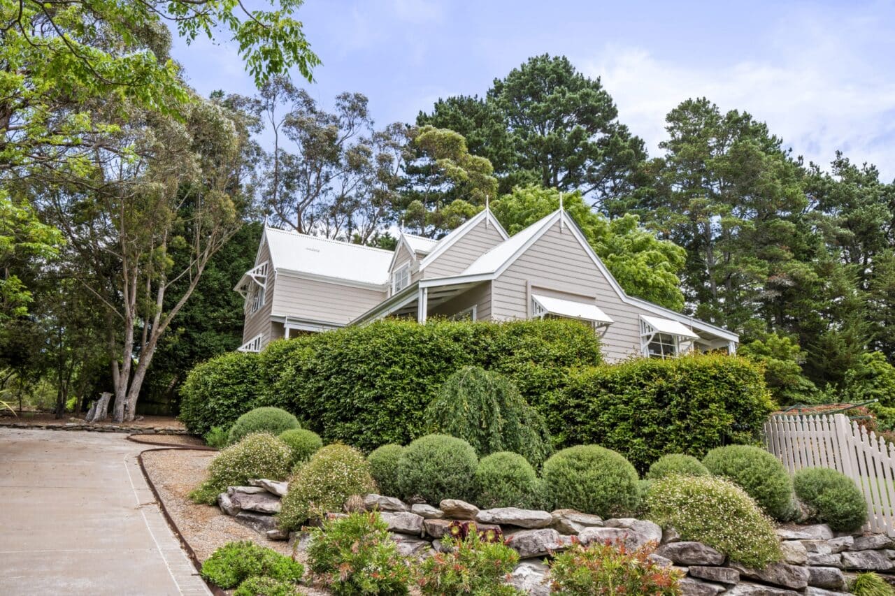
Heritage colours remain relevant for the many period homes throughout the area. Traditional schemes featuring creams, heritage greens, and deep reds respect the historical character of Federation and Victorian-era properties, similar to the heritage house restoration projects we’ve completed in Mount Victoria.
Contemporary neutrals with warm undertones are also gaining popularity, particularly in renovated spaces. Soft greys with beige undertones, warm whites, and gentle taupes provide a modern aesthetic whilst still feeling warm and inviting against the cooler climate of the mountains.
Exterior Versus Interior Colour Selection
The approach to selecting exterior and interior colours requires different considerations, though both should work together to create a cohesive overall aesthetic for your home.
For exterior painting, durability and regional appropriateness are paramount. External surfaces face harsh Australian weather conditions, including intense UV radiation, temperature fluctuations, and moisture. Choose high-quality, weather-resistant paints that can withstand these elements whilst maintaining their colour integrity.
The architectural style of your home should guide your exterior colour choices. Federation homes traditionally feature heritage colour schemes, whilst modern homes can embrace bolder, more contemporary palettes. Consider your neighbourhood context as well; whilst you want your home to have individual character, colours that are dramatically different from surrounding properties may affect future resale value.
For interiors, you have more freedom to express personal style, but maintaining flow between rooms creates a more cohesive feel. You don’t need to paint every room the same colour, but choosing a complementary palette throughout ensures smooth transitions as you move through the home.
Interior colours can be changed more easily than exterior colours, so you might be more adventurous with interior choices, particularly in smaller spaces like powder rooms or studies where a bold colour can make a strong statement.
Considerations for Coastal and Heritage Homes
The Blue Mountains region features both heritage properties and homes with coastal influences, each requiring special consideration when selecting paint colours.
For heritage homes, respecting the architectural period is important whilst still allowing for personal expression. Research the typical colour palettes of your home’s era and consider using historically appropriate colours for the exterior whilst bringing more contemporary choices to the interior. Our team has extensive experience with heritage properties, understanding the delicate balance between preservation and modernisation.
Coastal-style homes, popular in areas with views or more contemporary builds, often embrace lighter, airier palettes. Whites, soft blues, and natural timber tones create that relaxed, beach-inspired aesthetic even in an inland setting. These colours work particularly well with the natural light and can make spaces feel fresh and rejuvenated.
For both heritage and coastal properties, consider the existing materials and features. Exposed brick, timber details, or stone elements should influence your colour selections to ensure harmony between all elements of the design.
Professional Colour Consultation Makes the Difference
Whilst understanding the principles of colour selection is valuable, working with experienced professionals can save you time, money, and potential disappointment. At Blue Mountains Painting, our expert team brings years of experience in colour consultancy, helping clients navigate the often overwhelming array of choices to find the perfect palette for their space.
We understand the unique characteristics of homes in the Blue Mountains, Blacktown, and Lithgow regions, and we’re familiar with how different colours perform in various local conditions. From initial consultation through to final application, we’re committed to bringing your vision to life with skilled workmanship and genuine care for the things that matter most to you.
Whether you’re refreshing a single room or transforming your entire home, choosing the right paint colours is an investment in your daily comfort and enjoyment. By considering colour psychology, natural light, room size, regional trends, and the specific characteristics of your property, you can create a space that truly feels like home.
Ready to Transform Your Space?
If you’re looking for trusted partners to help you select and apply the perfect paint colours for your home, our team at Blue Mountains Painting is here to help. We offer comprehensive painting services alongside expert colour consultancy to ensure your space reflects your unique vision. Contact us today for a free, no-obligation quote and let’s bring colour to your world.